Table of Contents
Abandoned cart emails are one of the best ways to recover lost revenue and customers. When it comes to online shopping, an average of 69% of shoppers abandon their carts.
The reasons for cart abandonment are many; from technical difficulties like a website crash or complicated checkout process to mundane issues like a customer not being ready to buy yet.
We’ve talked about the science behind abandoned carts before and discussed using abandoned cart emails as one of the tactics to reduce the abandoned cart rate.
However, in this post, we’d like to show you the best abandoned cart email examples from established brands so you can use them as inspiration for your own.
11 Best Abandoned Cart Email Examples That You Can Learn From
We scoured the Internet to find the best-abandoned cart email examples. You’ll find examples from both well-known and smaller brands that know the benefits of reminding shoppers they left items in their bags.
1. Abandoned Cart Email Example from Kate Spade
Kate Spade’s abandoned cart email starts off with a catchy and inviting subject line: “Let’s check this off your list,” followed by an encouraging “you’re almost there!”
The email then makes a point of letting you know that customer care is only a click away if you have difficulties checking out and adds a call-to-action that prompts you to finish the checkout process.
They’ve also included images of items you’ve added to the cart which serves as a nice visual reminder.

2. Abandoned Cart Email Example by Made
Made’s abandoned cart email drops in your inbox with a casual subject line that reads like it’s coming from your best friend: “Btw – your shopping basket is still active“.
The email reminds you that you’ve left items in the cart and then introduces a scarcity and urgency element by letting you know they can’t promise to hold those items forever.
You’ll notice a visual of the item you’ve left behind and a simple call to action that takes you straight to your cart. Made also makes it easy to contact them or shop other departments by adding unobtrusive links below the CTA button.

3. SOKO Glam’s Abandoned Cart Email Example
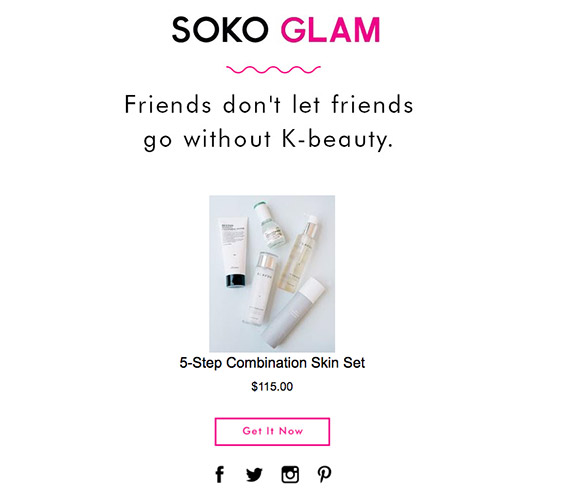
If you’re a fan of minimal design and you love getting straight to the point, you’ll love the abandoned cart email sent out by SOKO Glam. The subject line reads: “Don’t miss out…” which serves as a subtle attention-grabber.
It’s as minimal as it can be, including a large, friendly headline, an image of the item, price, and a call to action button.
Even though it’s minimal, this email is a great example of how to inject your brand into your emails without wasting unnecessary words or your reader’s time.

4. Abandoned Cart Email Example by Thrive Market
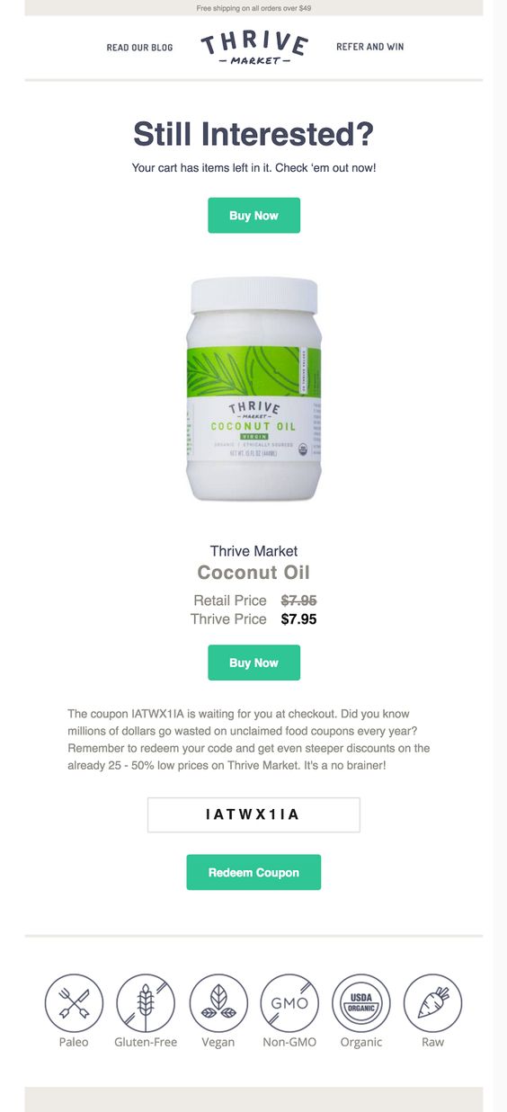
Thrive Market uses minimal copy similar to SOKO Glam above but goes a step further in their abandoned cart email. Their subject line grabs your attention with the question: “Still Interested?“
Aside from the standard prominent visual and two strategically placed calls to action, they present you with a coupon that you can use during checkout for even better savings.
The final and third CTA button that invites you to redeem the coupon is a clever way of encouraging you to complete the purchase without being overly repetitive.


Wondering how to bring back your Abandoned cart users?
Abandoned Cart Pro for WooCommerce is loaded with useful features that help you send an effective volume of reminders via text, email, and messenger. You can also share and manage discount codes that will encourage your customers to complete their orders.
Even better, you can stop the cart abandonment with the exit intent popup!
5. Abandoned Cart Email Example by Warby Parker
Warby Parker uses a casual tone in this abandoned cart email example and similar to others, a large visual of the item left in the bag to trigger the buyer’s memory. They pique your curiosity with “Want a better look?” as the subject line.
As an additional incentive, this retailer promises no risk to the buyer since shipping and returns are both free.
Simple copy, a singular call to action, and added incentive are rounded out by a subtle reminder that customer service is ready to assist you and answer any potential questions which serve as yet another way to eliminate any buying objections and nudges you one step closer towards the sale.

6. Bloomingdale’s Abandoned Cart Email Example
Bloomingdale’s uses a bold and large header that is very inviting followed by a prominent call to action and an image of the item that was in the abandoned cart.
The subject line “Make it yours” is certainly tempting and there’s a subtle urgency reminder that the item won’t last forever.
The footer of the email does a great job of reminding you of the benefits such as free shipping and returns and loyalty points that are earned with each purchase.

7. Abandoned Cart Email Example from Jack Wills Clothings
Clothing store Jack Wills makes great use of images in their abandoned cart emails and add a few extra incentives to not only jog your memory but also to increase the likelihood of a customer coming back even more.
The tone of their email is very casual, right from the subject line that reads “Don’t worry we’ve got you“. You’ll notice that several images are used for each individual item in the basket as well as suggestions for similar items.
Jack Wills uses multiple calls to action in this email that rotate between inviting you to return to your items and viewing items you have in your cart or similar and related items. Finally, the extra incentive is noticeable with the offer of free delivery.

8. Dote’s Abandoned Cart Email Example
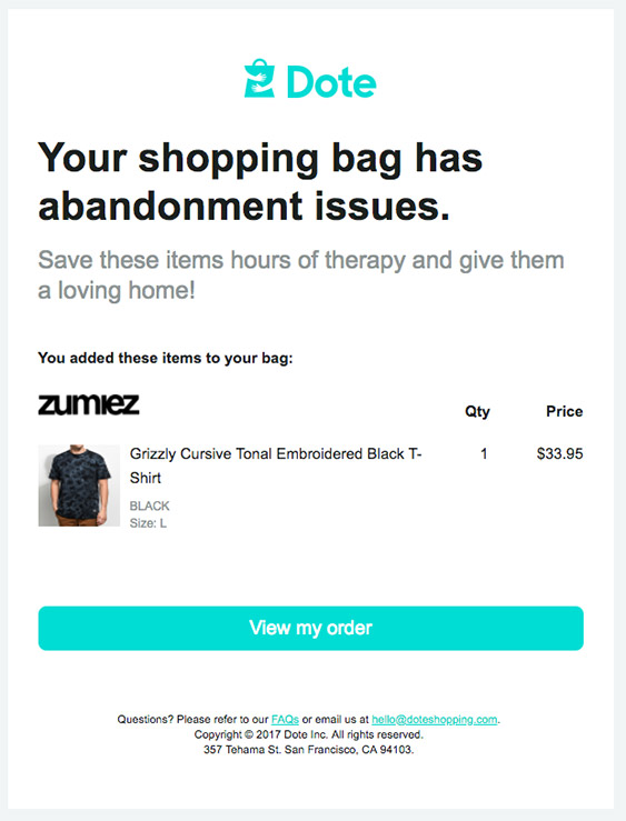
A dose of humour goes a long way and Dote makes great use of it in their abandoned cart emails. Just take a look at their subject line that’s bound to put a smirk on your face: “Your shopping bag has abandonment issues.“
This is another example of a simple and straightforward email that includes a tongue-in-cheek headline, an image of the forgotten item, and a prominent call to action inviting you to finish the checkout process.

9. J. Crew’s Abandoned Cart Email Example
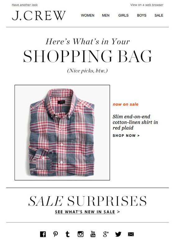
J. Crew definitely stands out in your inbox with a subject line that reads “Your shopping bag has news…”. Once you open the email, you’re greeted by a large photo of the item you’ve left behind and notice that it’s on sale.
The call to action subtly reminds you to go back and complete your purchase while the rest of the email tries to intrigue you by promising more sales surprises.

10. Abandoned Cart Email Example by Adidas
Adidas adds a touch of subtle humour in their abandoned cart email but also places a fairly large image of the item as a great visual reminder. They do a great job of using the disruption technique to grab your attention with the subject line: “Is your Wi-Fi OK?“
They also offer the ability to go straight to checkout or customize your item with two noticeable CTA buttons.
However, what really makes this abandoned cart email stand out is the use of customer reviews about the item in question. This is a great way to build trust and encourage the sale, considering statistics show reviews play an important role in buying decisions.

11. Levi’s Abandoned Cart Email
The last abandoned cart email example on our list comes from Levi’s. Their email starts off with one question: “Why wait?” It does a great job of attracting attention and getting you to open the email. The standard visual and two calls to action are easy to spot.
Levi’s takes it a step further by suggesting items that would complete your look which is a nice and subtle way to push an upsell without going over the top.

Take Your Abandoned Cart Emails to The Next Level
The examples above are just the tip of the iceberg but they are a good starting point toward understanding the anatomy of a well-crafted abandoned cart email. Use them as inspiration and then tweak your template in Abandoned Cart Pro accordingly. Happy selling!
SaveSave


Great and inspirational examples (I hope people won’t just steal these, but think of something original), funny but straight to the point! The one from Dote is amazing :)) ‘abandonment issues’ who thinks of that!
I am glad you like it Teodor. 🙂 It’s important to modify these to suit your own businesses. Just using the same ones is easy enough, but it’s always good to test what suits your audience best.